I have used a lot of analytics dashboards. Bar charts. Donuts. Sparklines. Heatmaps with a row of weeks across the top. Every one of them showed me numbers about my life and made me feel slightly worse about my life.
The wardrobe analytics in Clottr — they call it the Insights tab — are different. They’re not a dashboard. They’re an editorial column. Five beats, written like a stylist who likes you wrote them, scored by an AI that’s been quietly watching your closet for a season. Mine landed yesterday. It read like a love letter. I’m going to walk through it section by section, because I think this is the kind of thing you have to see to believe.
Beat one: The Hero
“In color play, you’re in the top 12% of Clottr users this month.”
That’s it. One sentence, in Fraunces italic, sitting on a soft cream card. No chart. No “score: 88.” Just a percentile delivered with a touch of editorial swagger.
I had spent the previous three weeks consciously reaching for the harder colors in my closet — the burnt orange, the deep olive, the cream. I didn’t know I was doing it more than other people. The hero beat saw the pattern and gave it back to me as praise. The serif made me feel like the praise meant something.
This is, structurally, exactly the same data a normal app would show as a bar chart titled “Color diversity index: 88.” Nobody reads that. The serif italic makes you read it.
Beat two: Today
“Three pieces in your wardrobe are dressed for the weather you’re walking into and haven’t been worn in over a month.”
The card below names the three. Tap any of them and the AI builds an outfit around it for the day. This is where the analytics layer touches the daily fits — it doesn’t just observe, it suggests.
What I love about this beat is the framing. Dressed for the weather you’re walking into. Not “unworn for 30+ days, sorted descending.” The system is telling me a story about my closet today, not throwing me a list to feel guilty about.
Beat three: Palette
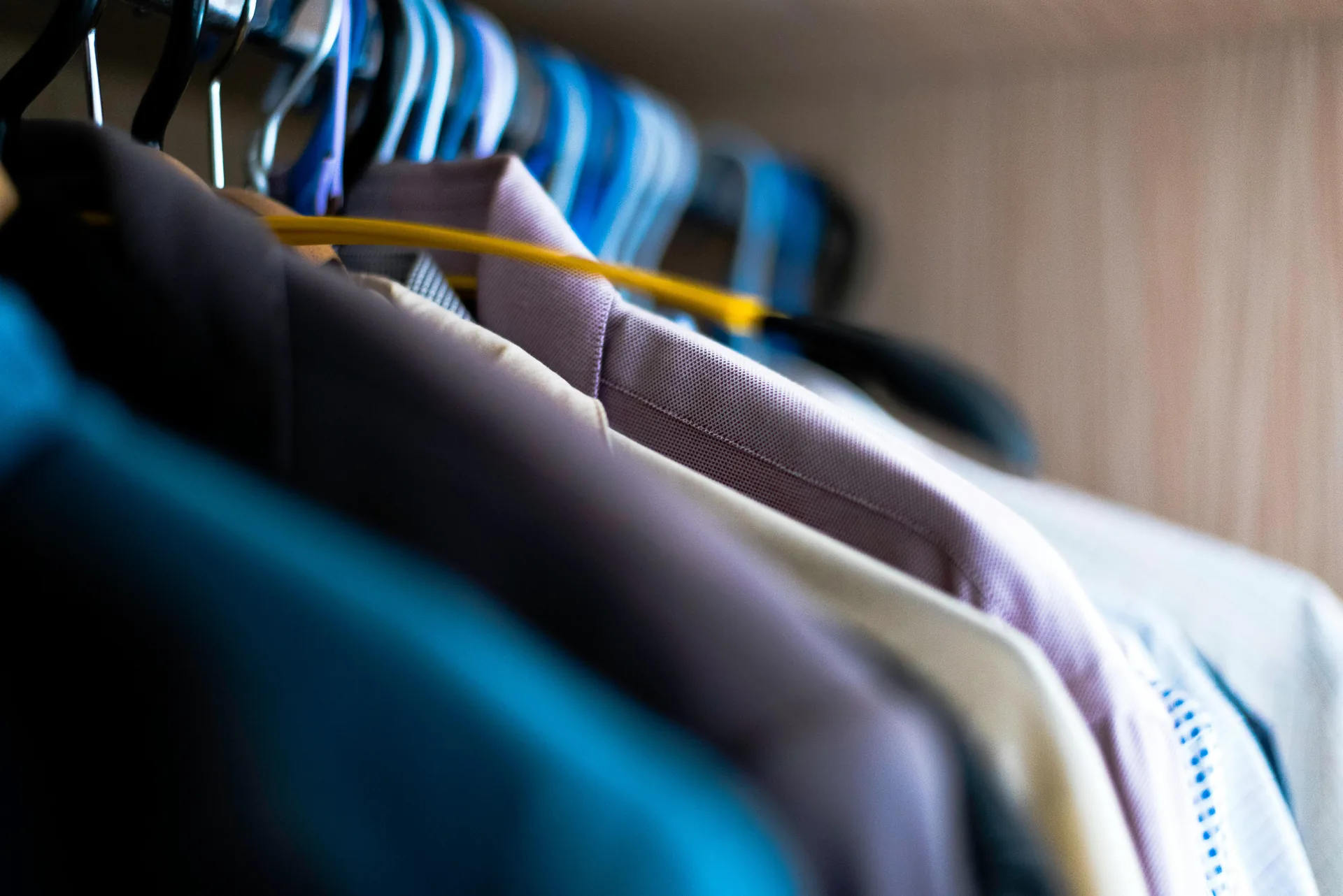
“A quiet shift toward warm neutrals. Cream is up 38% week over week. Black is down 14%.”
This one stopped me. I genuinely hadn’t noticed. I’d just been picking what I felt like. The AI watched a week of choices and surfaced the drift before I’d named it.
Underneath the sentence is a horizontal swatch strip — eight color blocks in the proportions they appeared this week. It’s beautiful. It looks like a paint swatch from a fashion magazine, and it is, factually, my week of outfits.
This is the kind of thing you couldn’t generate yourself with a spreadsheet. You’d have to be tracking the exact pixel-color average of every fit and run differential analysis week over week. The AI does it in the background. The result is one line of prose and a swatch.
Beat four: Streak
“11 days dressed by Clottr. Two more, and you unlock the Spring tier.”
A circular progress meter. A small badge preview. A gentle nudge.
I am, by nature, a person who resents gamification. Streaks make me anxious. Achievements make me feel I am being manipulated by a venture-funded engagement curve.
But this streak meter doesn’t demand anything. It just notes. Eleven days. Two more. There’s no notification storm if I miss a day. There’s no shame in the email if I break the streak. The tier exists, but the tone never pivots to a salesy don’t lose your streak! email. It is, refreshingly, the kind of streak system designed by people who don’t enjoy streak systems.
The reward when you hit the tier is real — extra try-ons, a custom color in your insights theme, an unlock for a beta feature. But the reward is not why you keep going. You keep going because the daily fit is good and you would have worn an outfit anyway.
Beat five: Deep cuts
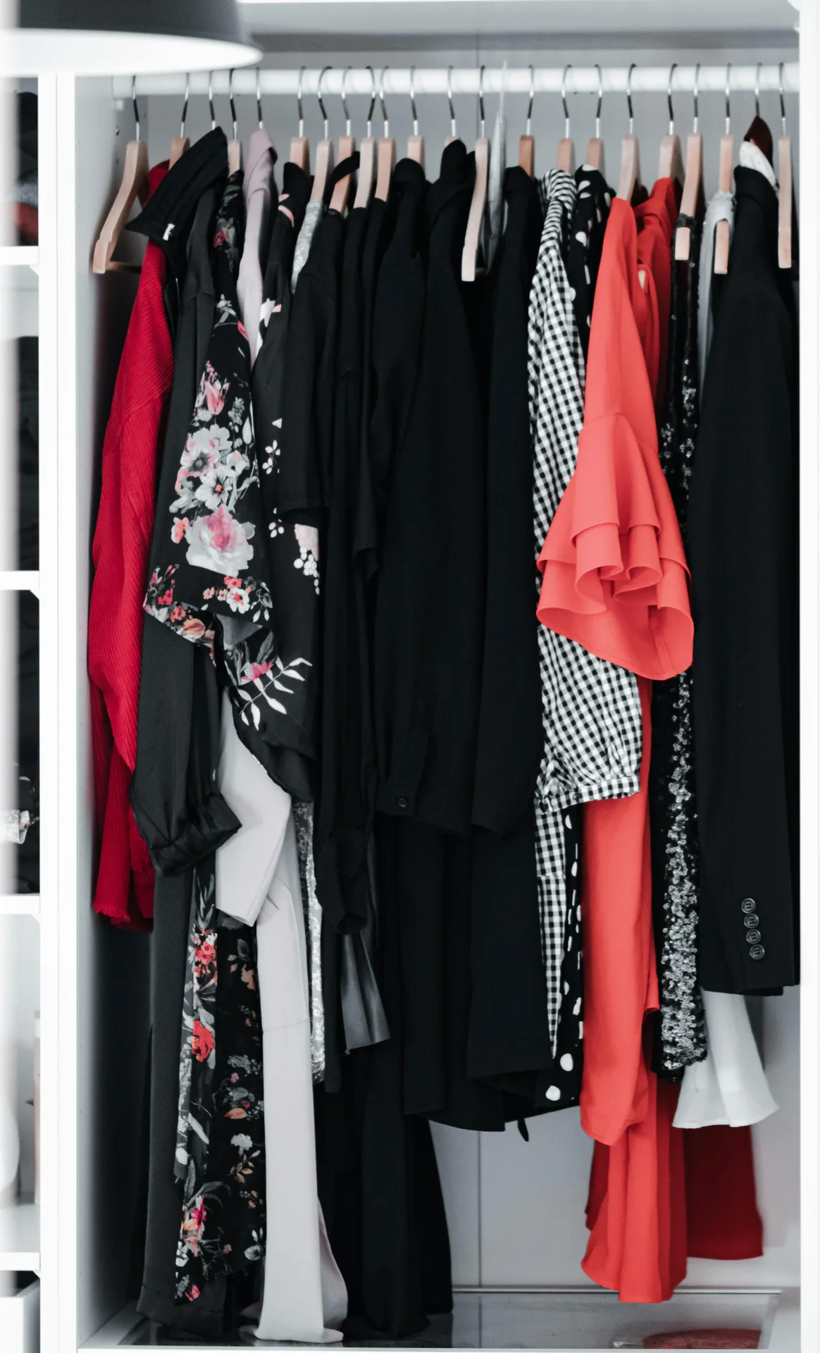
“The olive overshirt hasn’t been worn in 92 days. The weather is finally right.”
This is my favorite. Every week the AI surfaces 1-3 pieces that have been neglected for a while, but are weather-appropriate and style-coherent for the coming week. It calls them deep cuts, like a record collector pulling a vinyl out of the back of the crate.
The neglect detector is harder than it sounds. You don’t just want “least worn” — you want “least worn but currently appropriate.” A heavy wool coat that hasn’t been worn since February is correctly unworn in May. A linen overshirt that hasn’t been worn since February is wasted closet space until you put it on this week. The AI knows the difference.
I wore the olive overshirt three days later. It looked great. I remembered why I bought it.
Beat six: Recap
“Your most-worn piece this week: the navy blazer (4 outings). CPW just crossed below $4.”
The recap is what a finance dashboard would call the metrics that matter. Top piece by wears, CPW milestones, new entries to your wardrobe, the longest unbroken pairing (mine: the blazer and the cream shirt). Stats, but stats in service of a story.
This is also where the AI nudges retrospectively: “You wore the dinner shoes once this week — last week, three times. The shift looks intentional.” It’s holding up a mirror and pointing at the choices you didn’t notice you were making.
Why this works (and why other wardrobe apps don’t)
Most wardrobe apps try to be inventory systems. You log clothes, you tag them, you check them off when you wear them. The output is a spreadsheet you can sort.
Clottr’s insights take the same data and feed it through an editorial voice. The output is a column you read on a Monday morning while you drink coffee. The data is identical. The experience is different.
There’s a phrase I keep coming back to: analytics, written like editorial. That’s the whole thesis. You can give people the numbers, or you can write them a piece of prose that uses the numbers and lands as a story. The story is the thing that changes behavior.
I now plan my week off the recap. I make different shopping decisions because the deep-cuts beat keeps reminding me what I already own. I notice my palette drifts before they become ruts. None of that happened when I tried to track this stuff manually in a notes app two years ago.
What it isn’t
It isn’t a leaderboard. The percentile is a flavor note, not a competition. You can’t see other users’ palettes or streaks.
It isn’t surveillance. The AI sees what you log. If you don’t mark a fit as worn, it doesn’t show up in the recap. The data is yours, sitting on your device and in our database, used to compose your insights and nothing else.
It isn’t a place where you’ll get sold anything. The deep-cuts beat doesn’t surface shopping links. The recap doesn’t pivot into a sale. The insights tab is a reading experience, not a funnel.
What to do if your first week is boring
If you turn on insights and the first beat reads “you wore 5 pieces this week, mostly the same ones,” that’s correct. The system can only narrate what it sees. The narrative gets richer as you:
- Log fits consistently (one tap when you get home).
- Add the actual breadth of your wardrobe (not just the 10 things you reach for).
- Let the daily fits suggest pieces you don’t reach for on your own. The deep-cuts beat needs you to wear deep cuts.
By week four the insights are usually telling you something you didn’t know about yourself.
The bigger thing
Clothes are one of the few areas of life where the data is rich, personal, and almost never used. We’ve been quantifying steps and sleep and screen time for years. The closet — the thing we interact with for fifteen minutes every morning of every day — has been a black box.
Clottr’s insights crack it open. Not as a dashboard, not as a guilt trip, but as a small editorial column written for one reader. Mine. Yours.
This week mine told me I was wearing more color than usual, that I should pull the olive overshirt out, and that the navy blazer is officially the best-value piece in my closet.
That’s a love letter from a closet. I am going to keep opening it.
Want to read your own? Walk through the Insights tab in our wardrobe insights guide, or see Issue 01 — The Lineup for the full feature tour. For more on the data behind it, see how the daily fit email works or how Clottr compares to other wardrobe apps.